Resultaat
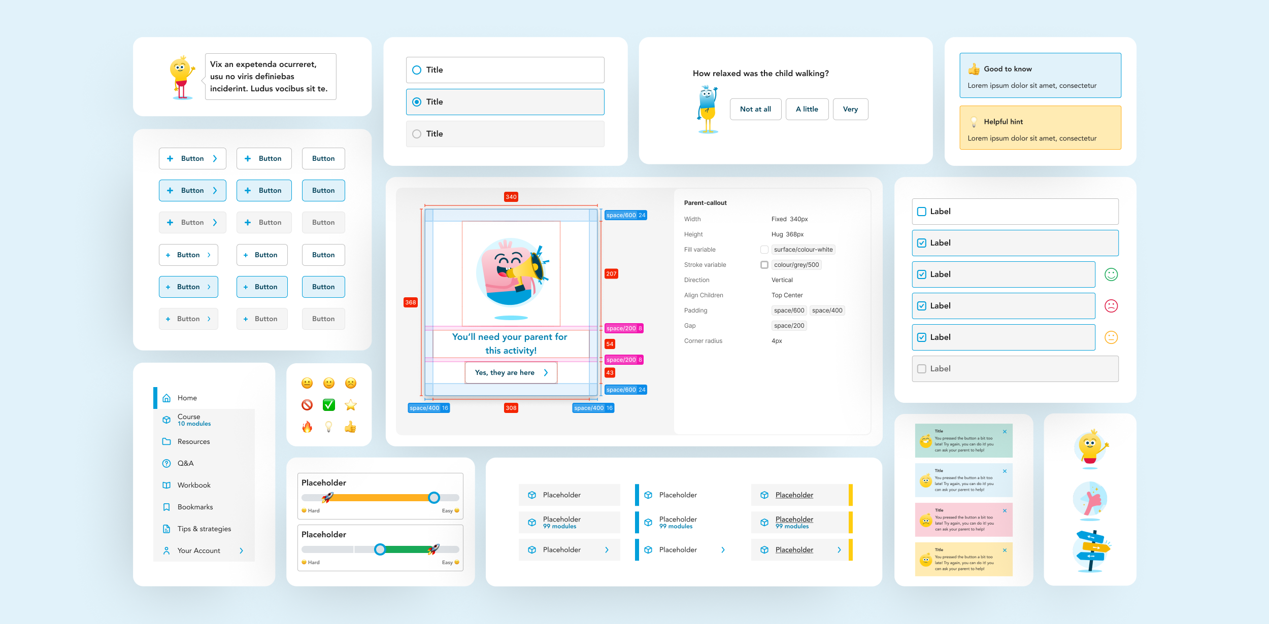
The final solution delivers a clear, supportive, and user-friendly digital experience.
The project demonstrates how user-centred design can transform complex information into a structured, engaging digital product. We applied behavioural design principles throughout the experience, including the Octalysis Framework, to balance intrinsic and extrinsic motivators.
UX psychology and cognitive bias awareness was embedded throughout the designs. By reducing decision fatigue, simplifying choices, avoiding information overload, and guiding attention through progressive disclosure, we ensured vulnerable users could stay focused and confident as they navigated the program.
Combined, these methods enabled us to transform printed material into a supportive digital journey, one that empowers parents, respects their emotional state, and drives real-world skill-building.
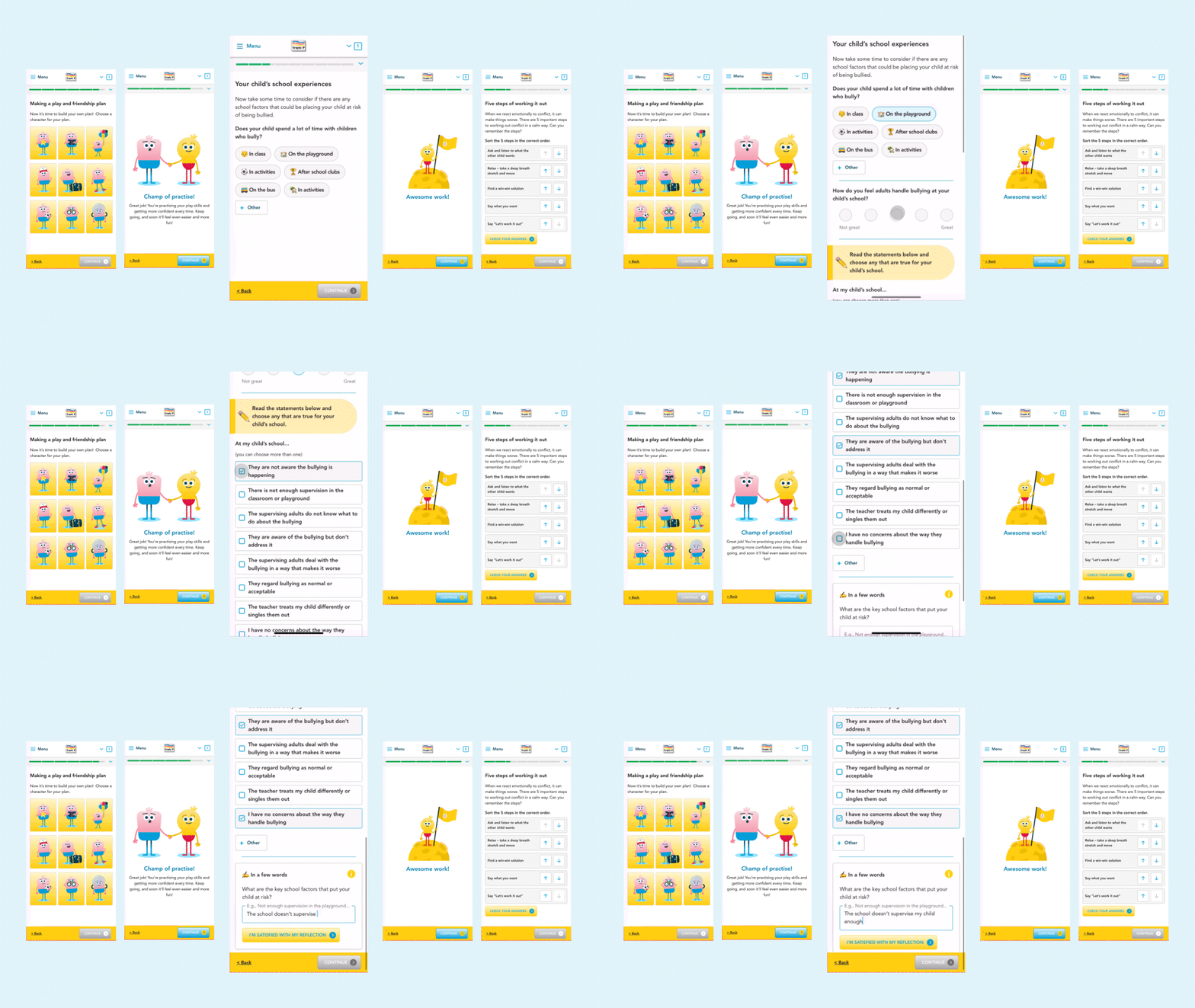
The existing in-person program booklets, learning objectives, and educational materials were analysed to identify core behaviours, motivations, and outcomes. Mapping emotional states and expectations uncovered key moments of stress, motivation, and disengagement throughout the parenting journey.
Based on the research findings, the challenge was reframed as a UX problem:
How might we support, educate and encourage parents and children in a way that feels personal, manageable, and encouraging rather than overwhelming?
Based on the research findings, the challenge was reframed as a UX problem: how might parents and children be supported, educated, and encouraged in a way that feels personal, manageable, and motivating rather than overwhelming?
This phase clarified how content, interactions, and progression could drive learning and behavioural change.
Close collaboration with the Clinical Research Team (CRT) ensured behavioural design decisions aligned with evidence-based practices and strengthened, rather than diluted, the program’s clinical integrity.
The result was a guided digital journey that enables parents to learn confidently at their own pace.
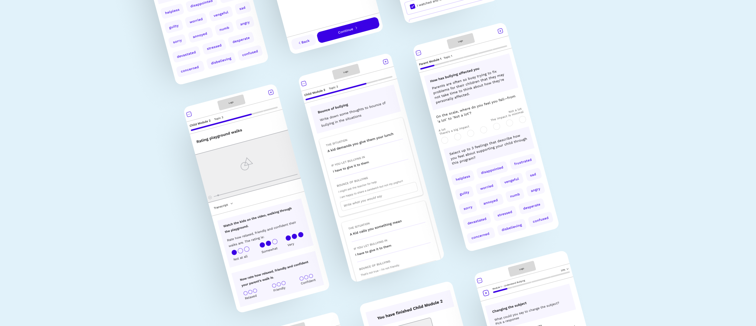
Based on these wireframes and the rough copy, the visual team created two different visual concepts that felt like one program but still differentiated the two environments.
Concept & visual Design
The digital Resilience Program needed to feel approachable, supportive, and easy to navigate, without distracting from the learning content. To achieve this, we developed a cohesive visual language: soft, friendly colors, clear typography, and consistent UI patterns guide parents through each module.
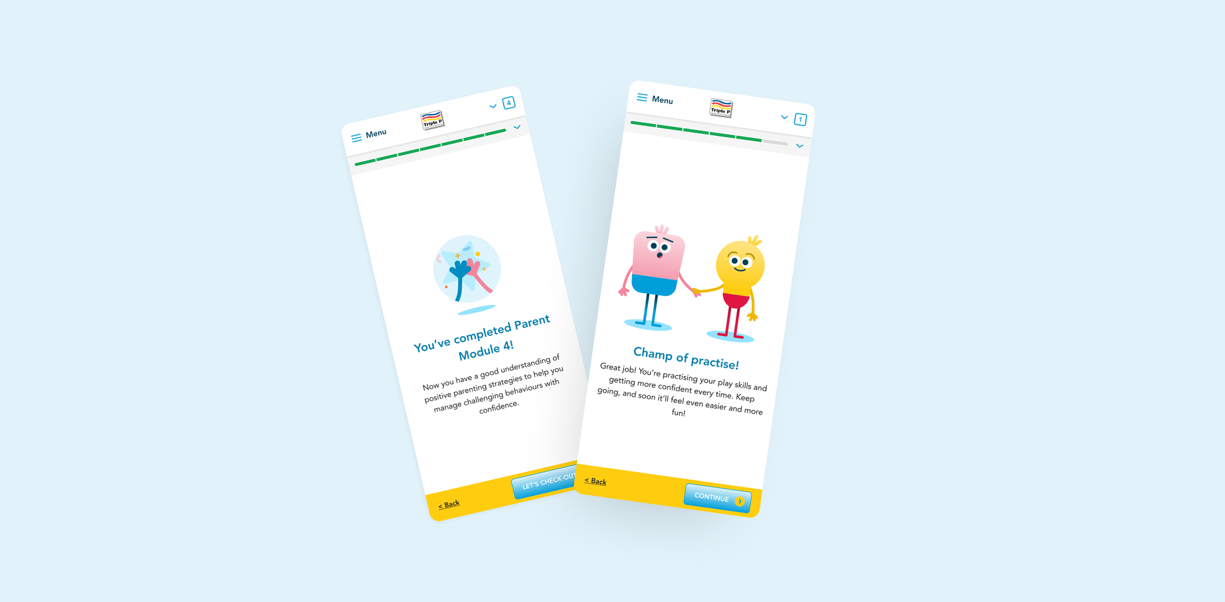
In the child-focused environment, we used characters to create a playful and engaging space. Meanwhile, the parent environment used the characters’ hands interacting with objects to provide subtle references, but they were never the main focus.
Interactions were designed to feel intuitive and encouraging. Buttons, toast notifications, progress indicators, and microinteractions provide subtle feedback, reassuring users as they complete exercises or reflect on content. White space and modular layouts reduce cognitive load, making dense information feel digestible.
Every visual and interaction choice was grounded in empathy: from calming color tones to approachable iconography, the design creates an environment where parents and children can learn confidently, engage meaningfully, and focus on applying strategies rather than navigating the interface.
Character development
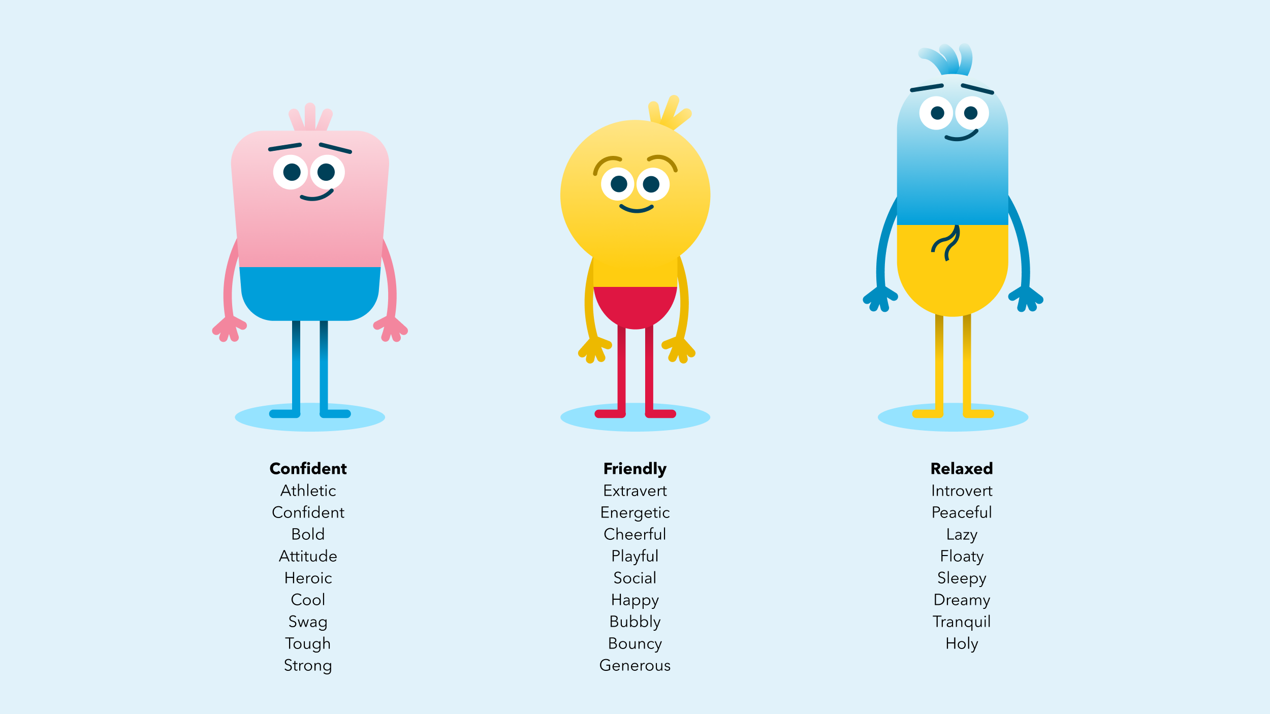
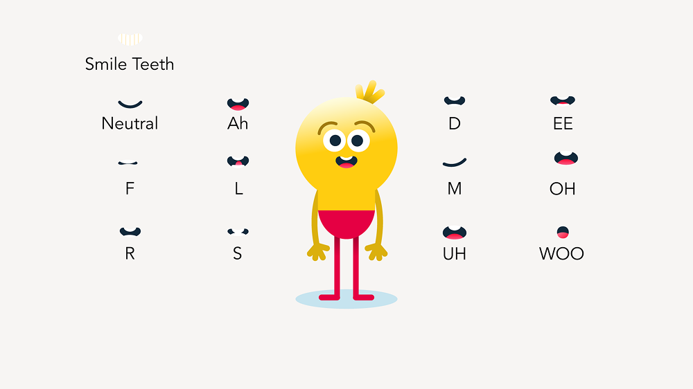
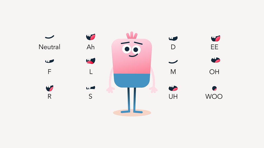
The three characters, friendly, relaxed and confident, embody certain emotional states which helps guide the storyline.
Shaping the characters' personalities provides an emotional layer, which forms the connection. The goal is to embody all three perspectives.
These characters will actively support the experience by driving, driving engagement and making learning more interactive and relatable. They will enhance and elevate the program by adding a fun and engaging element.
The scripts are written in a lighthearted, funny, playful, with crazy twists. It should feel like the characters are talking to the viewer, not at each other. Think high energy, quick turns, maybe even a little goofiness.
Design system
To ensure scalability, consistency, and efficiency across the platform, we developed a comprehensive design system that defined components, interaction patterns, and visual guidelines. This system provided a single source of truth for UI elements, typography, color, iconography, and layout, making it easier to maintain a cohesive experience as the platform evolved.
Close collaboration with the IT and development team ensured the design system was practical and implementable. Components were created with flexibility in mind, allowing developers to reuse them across modules while maintaining accessibility, performance, and responsiveness. Coordination between design and IT also facilitated smoother handoffs, faster iterations, and guaranteed that the final product matched the intended visual and interaction quality.